Gameplay First. Commit to Quality. Embrace Your Inner Geek. Play Nice; Play Fair.
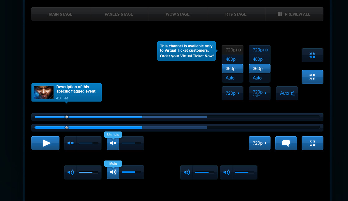
Early in my design career, I was lucky to work with industry leaders who set very high standards of quality to create truly epic experiences. Through the Web and Mobile team, I contributed to every Blizzard IP, the Battle.net web app, and the BlizzCon video streaming platform. However, my favorite project during my time there was revamping the World of Warcraft website.
Think Globally. Every Voice Matters. Learn & Grow. Lead Responsibly.
Website 1.0
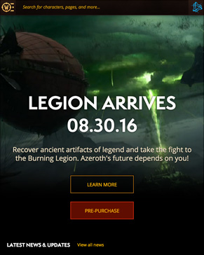
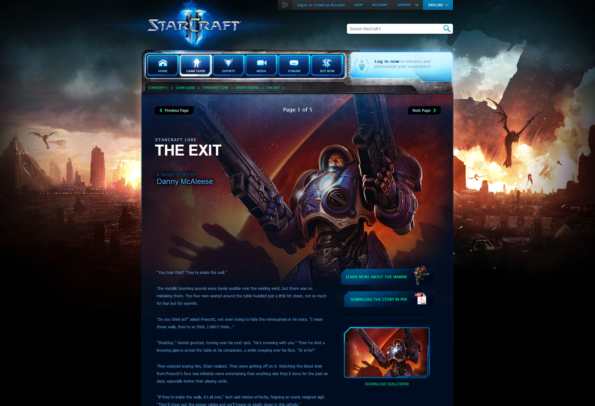
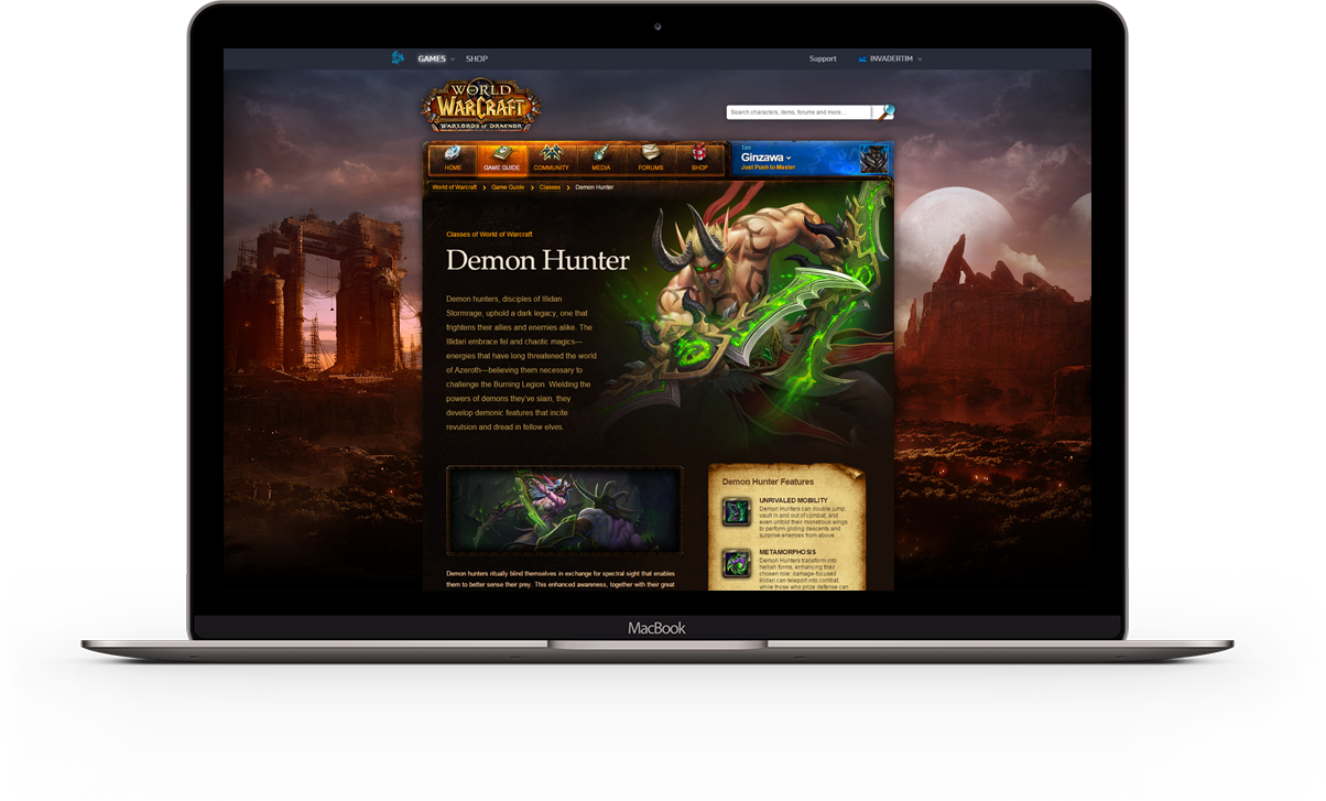
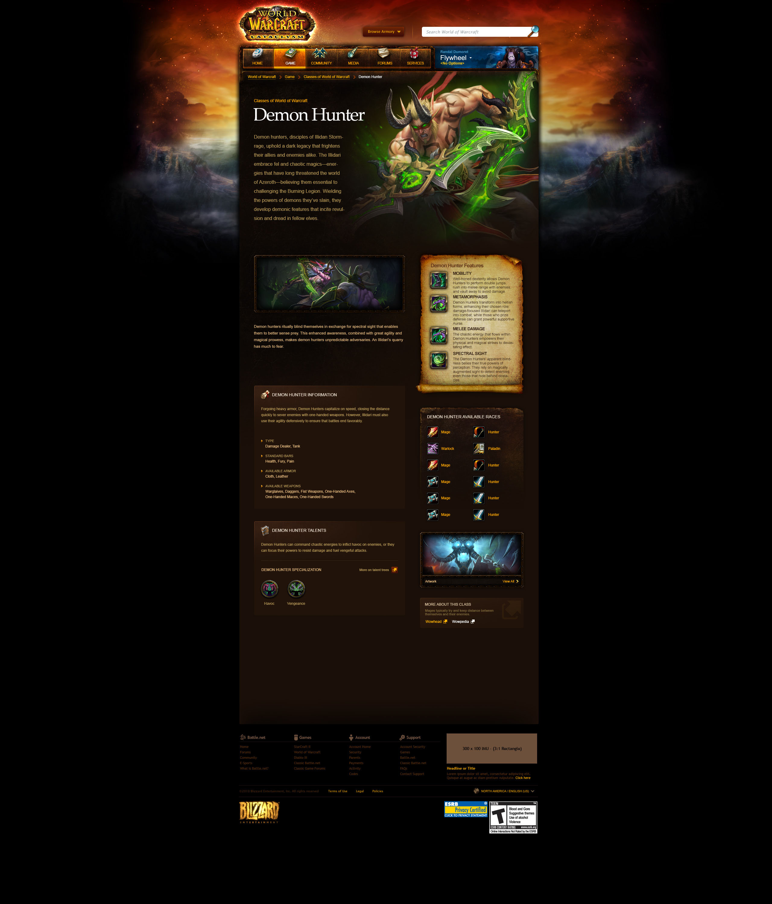
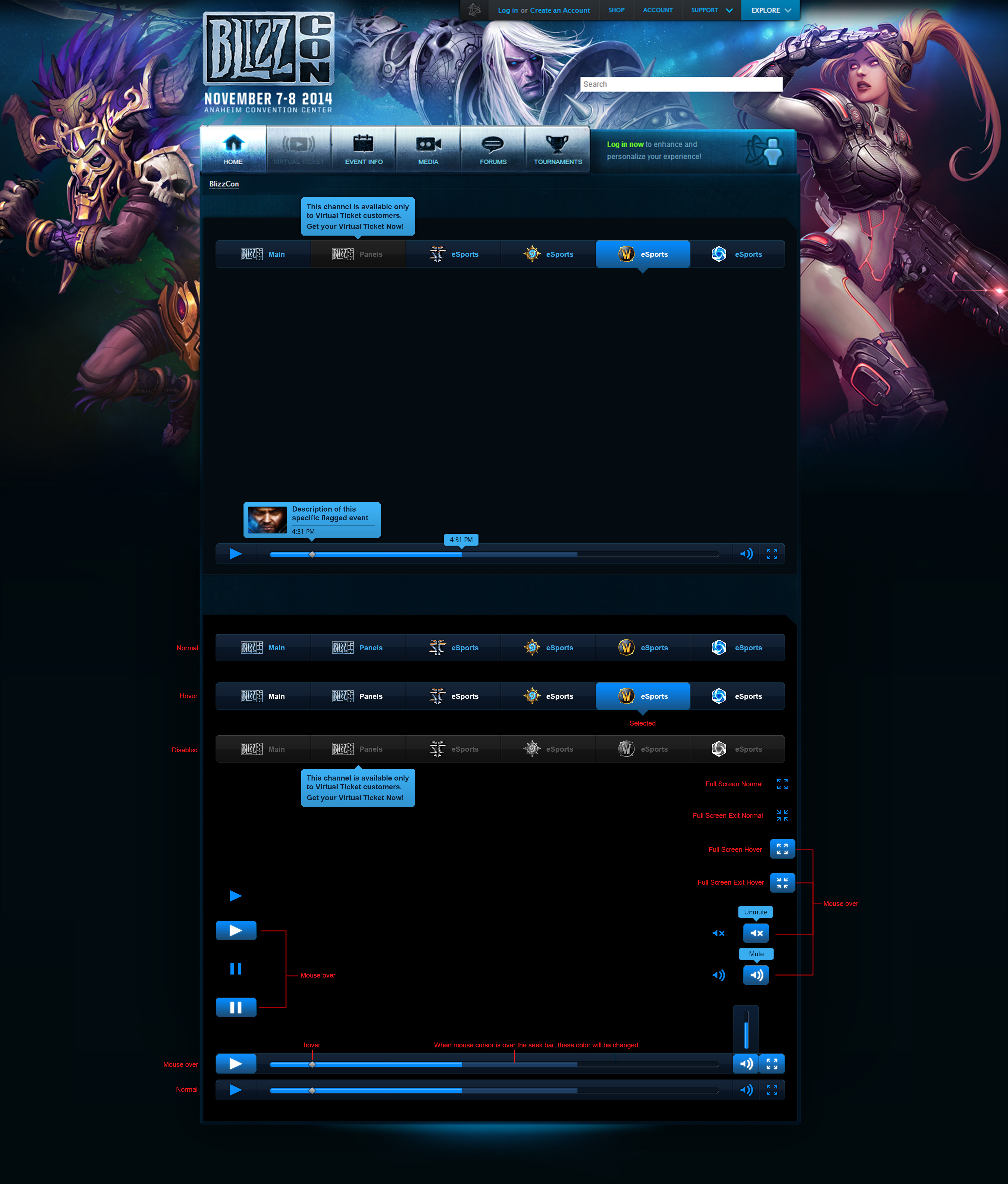
I made the last major edit to the original World of Warcraft website by adding a game guide page for the Demon Hunter class. A major downside of the old website was that it was not responsive for mobile devices. This was because most assets such as foreground and background images, buttons, and textures were baked in a single layer. This was the case with every Blizzard game and event webpage.
Wireframes
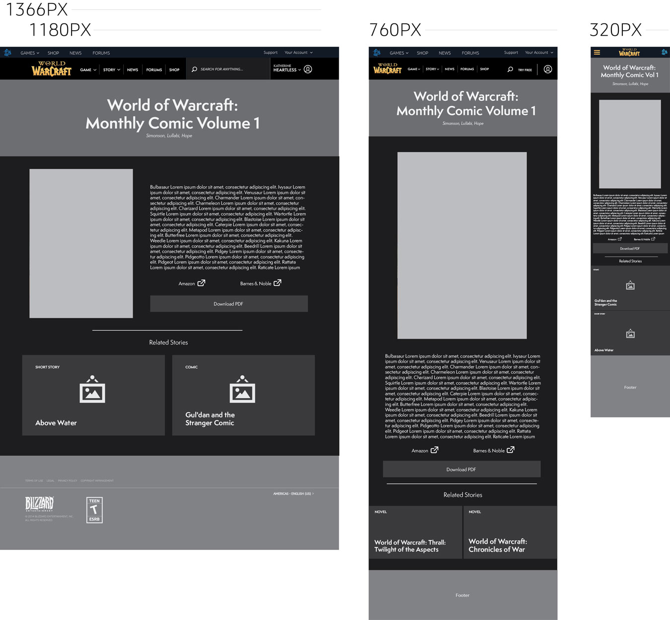
Coming up with a new layout was not a simple task because there was so much existing content. Even though we weren't able to maintain all the content from the legacy site, it also meant that we could explore supporting new kind content such as lore cinematics, webtoons, comics, and other community-driven content. Likewise, for other game and product websites, this meant that content would need to be revised or updated in some way to accomodate new, responsive layouts.
Rasters
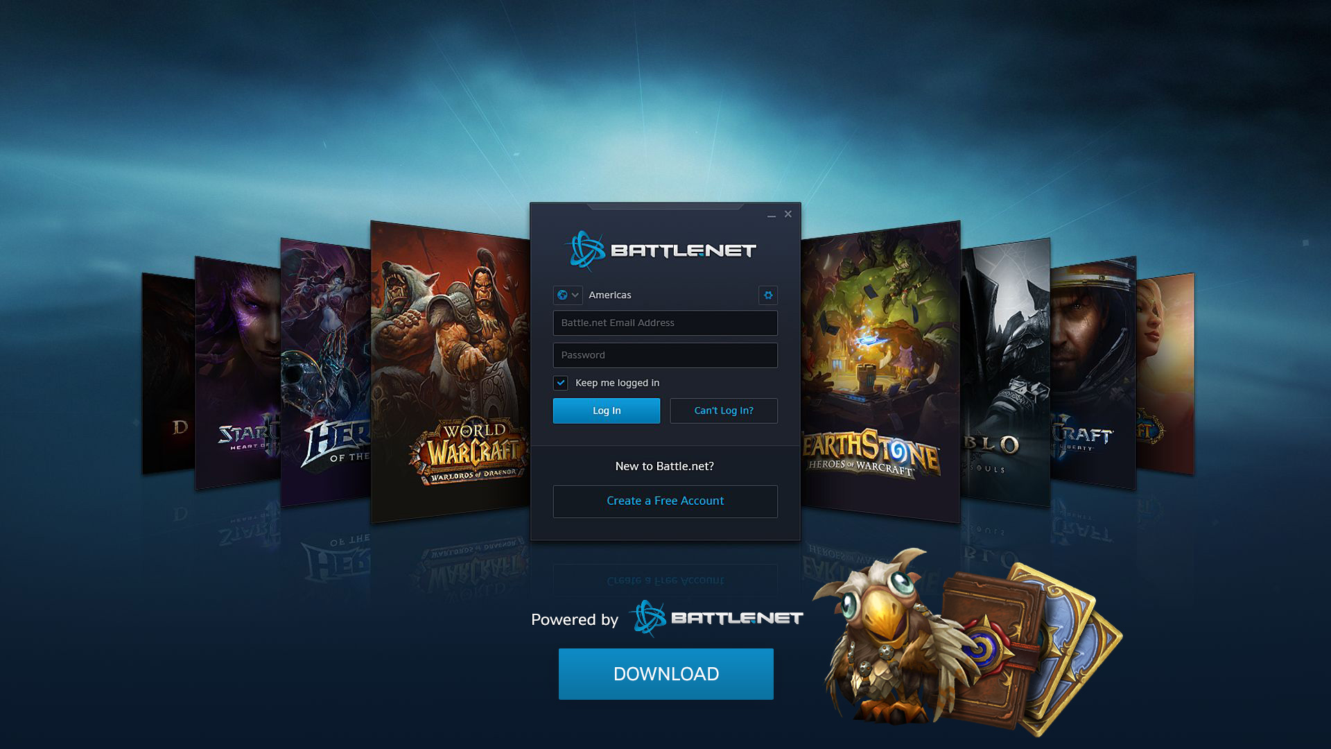
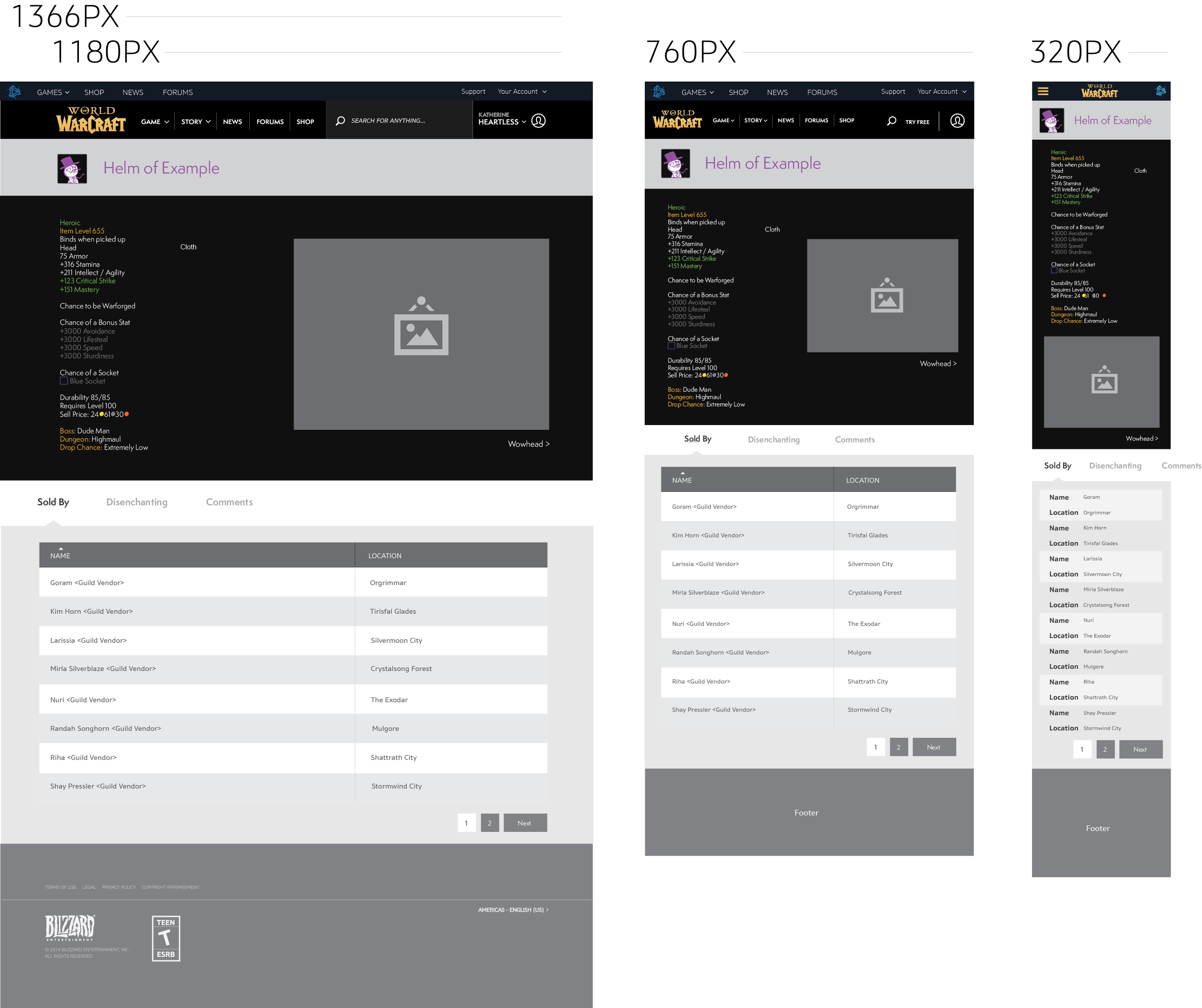
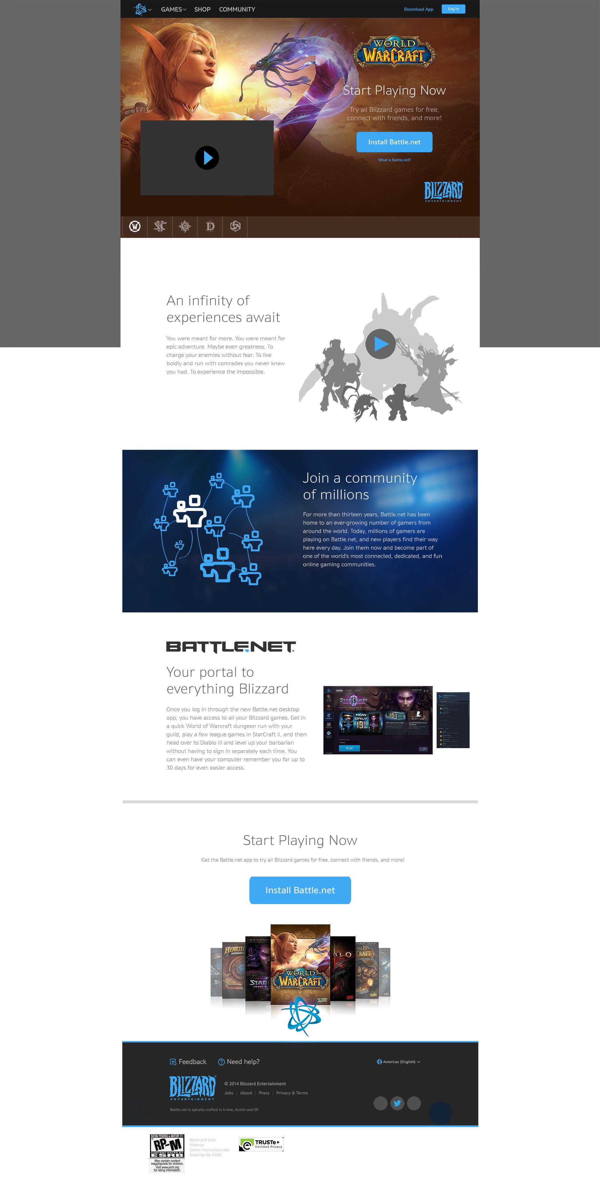
Working closely with engineers early on to determine what content could be displayed was a communication task that I learned was vital to page designs. In WoW's case, I prototyped a collection of every dungeon and raid in the game with helpful information such as zoning, boss mechanics, loot drops, and other media. In regards to redesigning the battle.net homepage, I had a different set of challenges to overcome, such as how to support more new game titles from a scalability perspective and how to show key features of the desktop application.
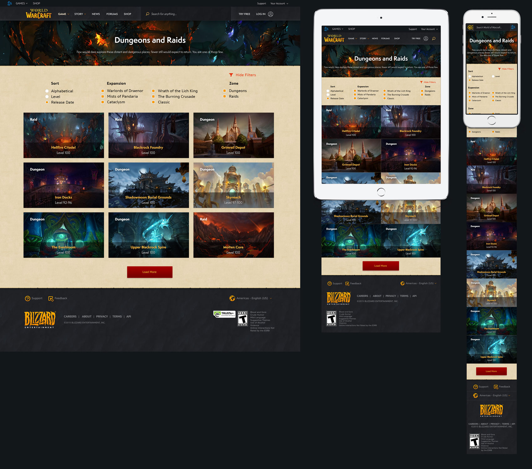
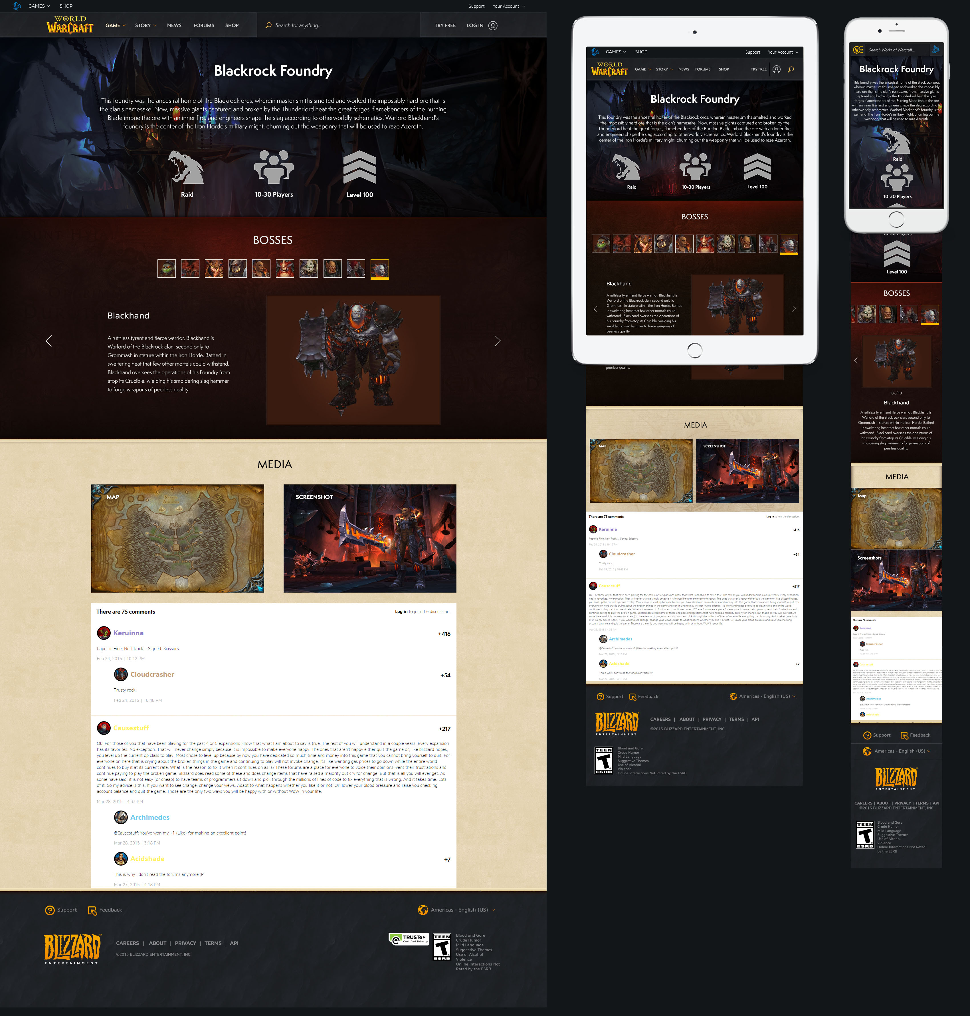
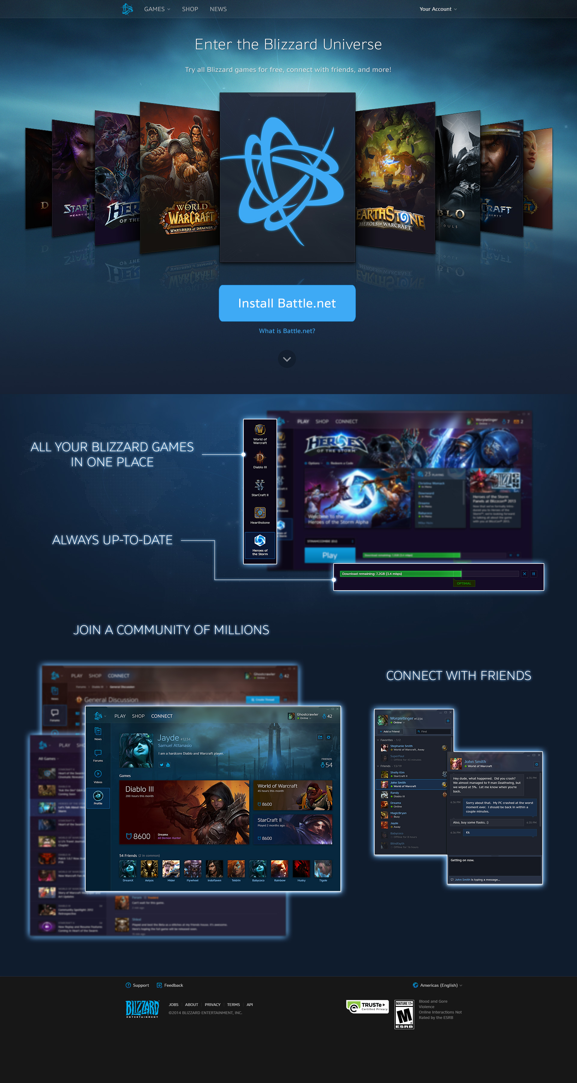
Website 2.0
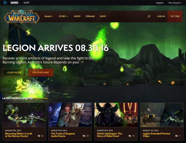
Colors and textures pay tribute to the game style and legacy website. Modular tiles make the website more configurable and provides a modern feel. Video backgrounds on the homepage will easily support all future expansion releases. The design of the World of Warcraft website has been updated for the foreseeable future.
